Widget User Guide
Daylight Version 4.9
Release Date 08/01/11
Copyright notice
This document, the Daylight Widget Library, and the Daylight Toolkit are copyrighted 1991-2011 by Daylight Chemical Information Systems, Inc. of Laguna Niguel, CA. Daylight explicitly grants permission to reproduce this document under the condition that it is reproduced in its entirety, including this notice. All other rights are reserved.
Daylight Widget User Guide
TABLE OF CONTENTS
- 1. GRINS
- 2. EDGAR
- 3. Depict Widget
- 4. File Widget
- 5. Message Widget
- 6. Help Widget
- 7. 3D Trackball Widget
- 8. Status Widget
- 9. TDT Widget
1. Graphical input of SMILES (Grins)
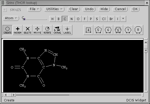
The "Grins Widget" is a portable molecular editor which can be used anywhere that a structure entry in SMILES or a connection table format might be used. Its specific goal is to provide a simple and efficient means of entering chemical structures. Also, as of version 4.33, GRINS can be used to specify SMARTS (though not all possible SMARTS).
While using Grins, you are always working with representations of chemical structures, not simply pictures. For instance, if you create a carbon atom, it appears as "CH4"; if you connect another carbon to it, both atoms appear as "CH3" with a single bond between them; if you click on the bond to make it double, a double bond is shown an the atoms appear as "CH2", etc. While it is possible to create unusual chemical structures using Grins, it is designed to make "usual" structures extremely easy to specify.
GRINS most important features are:
- A. a large, scrollable canvas on which the user "draws" a structure,
- B. a set of construction "Tools"
- C. a library of parent structures and other utilities
- D. an "OK" button with which to indicate completion
1.1. Starting and finishing Grins
Grins is started by the calling program - typically in response to a "Grins" button click - it is "active and running" whenever it is visible. (You can refer to the title of the Grins frame to find out which program invoked it.)
You specify a structure in Grins by drawing it. When you are done, inform the program by clicking on the "OK" button at the upper-left of the Grins window.
1.2. The Grins frame and drawing area
Grins provides a large drawing canvas (typically 1200 x 800 pixels) which is usually larger than the frame in which it is used. The canvas is scrollable in both directions, and the frame is resizable.
1.3. Grins Tools
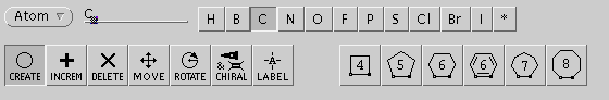
Grins provides a variety of input modes, or "tools", which are selected by their symbols located above the drawing canvas.
In all modes, the cursor shows the tool in use. Objects are selected automatically as the cursor moves over them. A selected atom is indicated by an inverted circle. A selected bond is indicated by an inverted square. Clicking on an atom or bond object performs the tool function directly. The SELECT (left) mouse button activates the primary action and the ADJUST (middle) button activates secondary or optional actions.
One general approach which can be used to specify a structure "from scratch" in Grins is to build a carbon template using the "Create" and "Template" tools then modify it with the "Increment" and "Label" tools. In practice, however, a user with access to a chemical information system rarely needs to build anything "from scratch", it's usually a matter of making small changes to a retrieved structure.
1.3.1. The "Create" Tool -- "O" icon
In "Create" mode, when the SELECT (left) mouse button is clicked over a blank area of the canvas, a CH4 is created at that location. If clicked over a bond, the bond order will be cycled (1-2-3). When dragged, a fixed length bond will be formed at fixed angles (30 degree increments) in the direction of the drag. If the drag is from/to an existing atom, that atom will form one end of the bond; if the drag is from/to a blank area, a methyl (CH3) will be created.
In "Create" mode, the ADJUST (middle) mouse button behaves identically to the SELECT button, except that bond length and angle are continuously variable.
1.3.2. The "Increment" Tool -- "+" icon
In "Increment" mode, when the SELECT (left) mouse button is clicked on a bond, the bond order is cycled (1-2-3). If over an atom, the element is cycled among common elements (H,B,C,N,O,F,P,S,Cl,Br,I). This is convenient for converting carbon frameworks to common organics; click once for N's, doubleclick for O's. If depressed on an atom and dragged, vertical motion will cause the element to cycle (handy for setting -H's).
In "Increment" mode, clicking the ADJUST (middle) mouse button over an atom cycles its formal charge (-1,0,+1).
1.3.3. The "Delete" Tool -- "X" icon
In "Delete" mode, when the SELECT (left) mouse button is clicked on an atom or bond, that atom is deleted. The ADJUST (middle button) is not active in this mode.
1.3.4. The "Move" Tool -- four-way-arrow icon
Atom or bond objects are moved in this mode by pointing to them, depressing the SELECT (left) mouse button, and dragging the cursor. If started over a blank area, a rectangular region is defined; when released, the next drag will move all objects in that region as a group.
If the ADJUST (middle) mouse button is down during a Move drag, all objects on the canvas will move together.
1.3.5. The "Rotate" Tool -- circular arrow icon
Rotations are done by dragging the "Rotate" tool, with the rotation relative to the starting position and zero rotation to the right. If done with the SELECT (left) button, the rotation must be started on an atom or bond object, that object's position is the center of rotation, and only the component containing that object is rotated. If done with the ADJUST (middle) button, everything is rotated at once and the center of rotation is the button-down location (need not be an atom or bond).
1.3.6. The "Chiral" Tool -- wedge icon
The Chiral tool is used to specify chirality by indicting bond directions in-to or out-of the plane of the screen. Directional bonds are indicated by wedges, with the fat end being nearer and the point being farther away.
Clicking the SELECT (left) mouse button over a single bond while in "Chiral" mode cycles bond direction (none-out-in).
Clicking the ADJUST (middle) mouse button while over a directional bond while in "Chiral" mode toggles between solid and hashed wedge renditions. Note: this can be used for aesthetic purposes only - "hashedness" has no effect on the structure specified - only the way the wedge points counts.
1.3.7. The "Label" Tool -- "A"-in-crosshairs icon
Arbitrary atom properties (atomic number, H-count, charge, isotopic mass) may be assigned in the "Label" mode. Unlike the "Create", "Delete", and "Increment" modes, this mode makes no attempt to maintain normal valence assumptions. Atom properties are specified by entering the atom specification on the "Atom:" line in SMILES-notation. H-count, charge, and mass are specified numerically, while the element is specified by a periodic-table-like menu. For example a carbon-13 atom with charge +2 is specified "[13C+2]".
Elements may be selected from the "organic subset" buttons or from the periodic table invoked by the "Other" pulldown.
The "Other" pulldown menu:
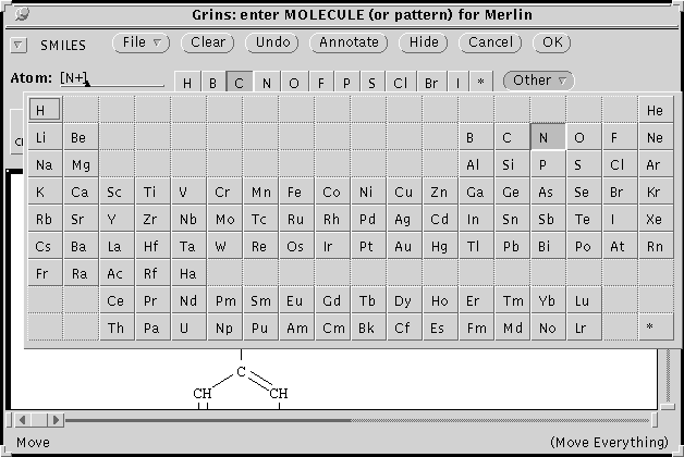
When in Label-mode, clicking the ADJUST (middle) button on an atom sets the properties in the "Atom properties" pin-up frame to those of that atom. Clicking the SELECT (left) button on an atom sets its properties to those in the "Atom properties" frame. This is particularly convenient if you need to set many atoms to be alike.
Note: Formal charge and H-count set here are not subject to "normal valence" adjustments (this can be reset by selecting atom while in Increment mode).
1.3.8. "Ring-Template" Tools -- icon shows ring, cursor is NE-pointing arrow
The ring-templates allow 3-8 membered rings to be added in single operations. Templates are selected by clicking on their icons in the "Grins Tools" pin-up frame.
If the drag is done with the SELECT (left) mouse button, template bonds will be fixed length unless cursor is released over an existing atom, in which case the template will be scaled to this bond length.
Template drags done with the ADJUST (middle) mouse button down work the same way except that bonds will be variable length (scaled to distance of drag).
1.5. Grins "Pop-up" menu
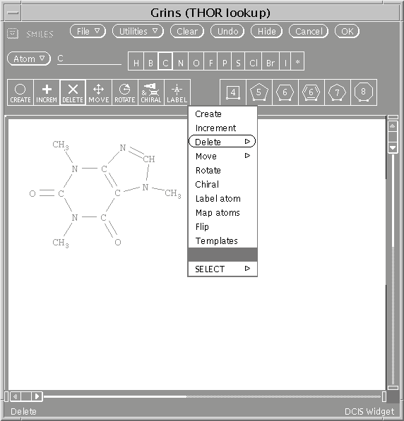
When the MENU (right) mouse button is depressed while in the Grins drawing area, a pop-up menu will appear which provides an powerful alternative to using the tools. Except for the templates, each tool is selectable from this menu. When popped-up over a blank area, selecting a mode is exactly equivalent to selecting the tool from the pop-up Tool frame. The extra power of the pop-up modes is that some tool actions can be specifed with respect to an object which is selected at the time the menu is popped-up.
- "Delete" menu item. When invoked while over an atom or bond, provides this pull-right menu:
- "Delete item" ... delete the object (same action as the Delete tool)
"Delete this component" ... delete entire disconnected component containing selected object
"Delete all other components" ... delete all components not containing selected object
"Delete everything" ... delete everything (like "Clear" utility)
- "Move" menu item. When invoked over an atom or bond, provides this pull-right menu:
- "Move this component" ... move disconnected component containing selected object
"Move all other components" ... move all components not containing selected object
"Move everything" ... move everything (like "ADJUST" move)
- "Flip" menu item. Flip the structure over. See utilities description, below.
- "Templates" menu item. Invokes the Tool frame with templates.
- "SELECT" menu item Not a mode, this sends partial results to the calling program:
- "Templates" menu item. Invokes the Tool frame with templates.
- "SELECT everything" ... send everything (like "Select" button)
"SELECT this component only" ... send disconnected component containing selected object
"SELECT all other components" ... send all components not containing selected object
1.6. Grins "File" Menu
The "File" pull down menu provides a number of useful functions.- "Parents"
- This cascading pull-right menu provides a large number of useful parent structures to work from, including most of the named ring systems, all of which are oriented in the standard way (i.e. numbering starts in the upperleft and goes clockwise). There is nothing magic about these files, they are just .tdt files created with the "Save..." command below. Therefore, users can create their own parents.
- "Open..."
- Read a .tdt file containing 2D data into Grins.
- "Add..."
- Same as "Open", but existing structure is not removed.
- "Save..."
- Write a .tdt file from the data currently in Grins.
- "Help"
- Invoke help widget.
1.7. Other GRINS buttons
- "Clear"
- Clears canvas
- "Undo"
- Undo last operation
- "Annotate"
- Comment on chemical "reasonableness" of structure
- "Hide"
- Hide GRINS
- "Cancel"
- Send a "Cancel" message to the calling program.
1.8. Options used by Grins
The following options are used by Grins:- GRINS_FONT_PRIMARY
- full name of font to be used for atom labels
- GRINS_FONT_SUBSCRIPT
- full name of font to be used for subscripts
- GRINS_PARENTDIR
- name of directory containing parent .tdt's
- GRINS_HEIGHT
- height of Grins widget frame
- GRINS_WIDTH
- width of Grins widget frame
- GRINS_X
- horizontal location of Grins widget frame
- GRINS_Y
- vertical location of Grins widget frame
- GRINS_MINFAST
- minimum number of atoms for "fast-motion"
- GRINS_PLANE_MASK
- color plane mask used for dragging
2. EDGAR (Editor for Graphic Attributes & Resources)
EDGAR (EDitor for Graphic Attributes & Resources) is a tool for customizing the attributes of the Daylight program interfaces for color systems. By first selecting from the color palette, and then selecting items on the EDGAR window, the user can "paint" the Daylight interface to accomodate the characteristics of the monitor and the user's tastes.
To use EDGAR, first choose from the 'Set' menu to select a category. Then modify the existing characteristics displayed by selecting from the color palette with the Select mouse button, and then selecting the item to be colored.
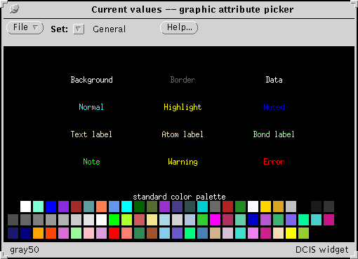
The 'General' screen allows customization
of several widely applicable attributes:
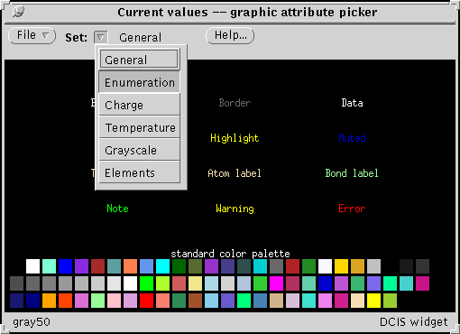
By selecting from the 'Set' menu other classes
of attributes can be changed.
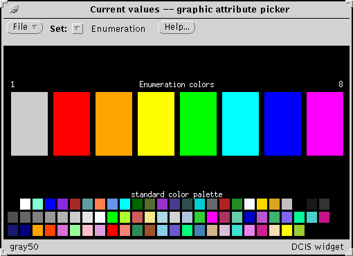
Enumeration colors are used when objects
are distinguished by color:
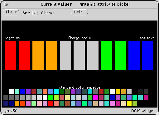
Charge can also be color-coded.

Black-body colors (dim red is cool, blue white is hot) are default
temperature colors but can be reset to emotional colors (blue is cool,
red is hot).
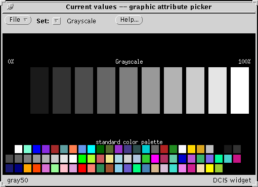
The gray-scale can also be adjusted to optimize the contrast for a given device.
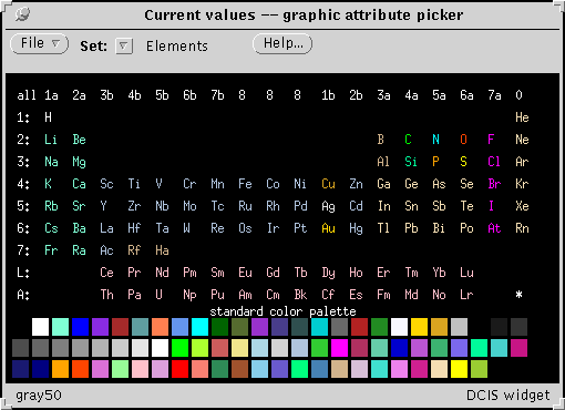
The 'Elements' screen allows customization of atom-colors for structural depictions.
3. The Depict Widget
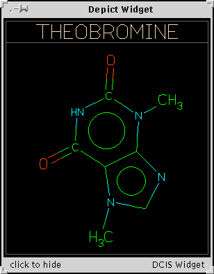
The "Depict Widget" displays diagrams of one or more molecular structures. Facilities are provided for simple display ("Display" mode), exclusive selection ("Pick one" and "Hot" modes) and non-exclusive selection ("Pick many" mode).
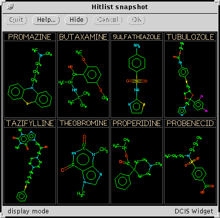
The XView Depict Widget creates a main frame with a control panel and drawing canvas. The frame header displays a title set by the calling program; the footer indicates the current mode.
The control panel consists of five buttons: "Quit", "Help", "Hide", "Cancel" and "OK". The "Quit" button is active only if the widget is an orphan (i.e., it was created with no parent frame, which is unusual). The "Help" button is always available. Other button functions are dependent on the mode of usage, as described below.
All available depictions are displayed in a grid on the primary drawing canvas. The Depict Widget will create a secondary "pop-up" frame to display a single depiction as needed. Both frames are resizeable.
- "Display" mode
- is used for simple display of a set of depictions; only the "Hide" button is active in this mode. Positioning the mouse pointer over a depiction and pressing the ADJUST button causes that depiction to be highlighted and drawn in a separate pop-up frame. This is particularly useful when a large number of depictions are displayed on the main canvas. The other mouse buttons have no effect in this mode.
- "Pick one" mode
- is used to make an exclusive choice; the "Cancel" and "OK" buttons on the control panel are active in this mode. Using the SELECT or ADJUST mouse buttons, click on the desired depiction (which highlights the choice), then on the "OK" button. If ADJUST is used, the choice is displayed in a pop-up window. Dragging the pointer around the canvas with the SELECT button down does the obvious thing (tracks your selection). You can exit without making a selection by clicking "Cancel" instead of "OK".
- "Hot" mode
- is similar to the "Pick one" mode except that the selection is made as soon as the mouse button is clicked on a depiction; there is no need (nor opportunity) to select "OK". This mode is used when the selection is going to do something computationally cheap and visually obvious, such as look something up in a Thor database.
- "Pick many" mode
- is used to choose depictions in a non-exclusive mannner; one or more (or none or all) depictions may be selected. The "Cancel" and "OK" buttons are active in this mode. The SELECT button toggles selection of the depiction underlying the mouse pointer. Dragging the mouse with the SELECT button down extends the selection in a method similar to painting a rectangle. Clicking the ADJUST button brings up the pop-up window as with the other modes. Selected depictions are highlighted; when the desired selection is highlighted, click on "OK" (or "Cancel" to cancel without makeing a selection).
4. The File Widget
The File Widget allows the user to specify a file name. The calling program can provide hints to the user (e.g. a prompt) and specify requirements of the file.
Near the bottom of the frame is a text field labelled "File:" and three buttons: "Cancel", "Open", and "Select". A file name can be specified by typing it into the text field and clicking "Select" (or pressing RETURN).
Above the text field is a scrolling list containing the names of files in the directory shown in at the top of the frame. The directory name is actually the current selection in a pull-down choice list containing the names of that directory's parents back to the root, "/".
Clicking on a file name in the scrolling list makes it the current selection (appears in the "File:" text field). If the file is a subdirectory (indicated by a trailing slash), the "Open" button will be active; if not, the "Select" button will be active. Double-clicking on a filename automatically performs the default action ("Open" if a directory, "Select" if non-directory file).
To the right of the scrolling list are a set of convenience controls:
- "Show all"
- if checked, all accessable files (including "." and "..") are shown (ignoring hints given by the calling program).
- "Sort type"
- a menu of sort types: "No sort", "Name sort" (default), "Size sort", and "Date sort" (actually, time modified).
- "Reverse sort"
- if checked, sort order is reversed from natural order
- "HOME"
- button makes the environment variable HOME the current directory
- "Revert"
- button resets the current directory to that originally specified
- "Help"
- button invokes the Daylight help facility (with this help)
5. The Message Widget
The Message Widget is used to display notes, warnings, and error messages generated by the Daylight system. This widget provides only an output interface for the user; the underlying error system handles all other issues such as formating, message source identification, and language translations.
The message widget appears when messages from the Daylight system are queued up for display. Each message contains the name of the program which generated the message, an indication of severity (NOTE, WARNING, ERROR, or FATAL ERROR), and one or more lines of message text.
The XView message widget creates a pinned-up command frame with messages in a scrolling text subwindow. Pulling the pushpin "out" hides the widget; it will automatically reappear when subsequent messages are to be displayed. Messages are saved until the XView textsw buffer is filled (normally 20,000 characters).
A "Clear" button on the control panel deletes the widget contents. The normal XView text window pop-up menu is available by clicking the mouse MENU button (usually the right one) on the area containing message text. Useful pop-up menu functions include searching for a specific string and saving the message text to a file.
6. The Help Widget
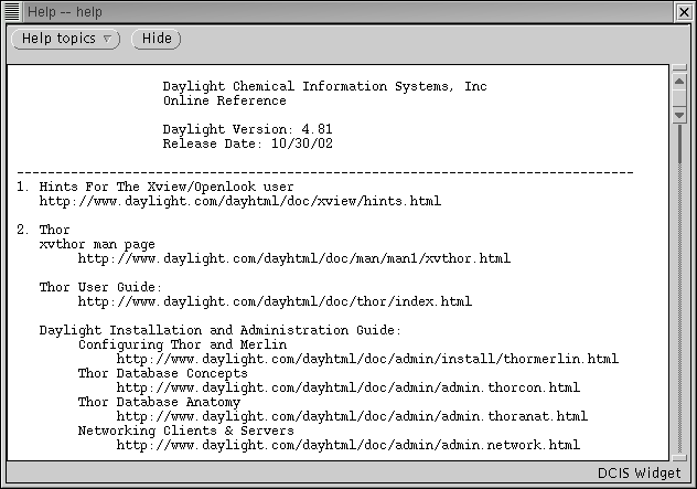
The "Help Widget" is a facility for providing the user with helpful text. The Help Widget is typically invoked by a "Help" button.
Help Widget files are provided by "package" which typically includes reference information for number of related topics. Programs invoke the Help Widget for a given package and keyword - when the help file appears, the given keyword will be visible.
However invoked, the user can browse other available Help files by use of a pull-down menu.
Help Widget documents are intended to be extremely portable: they are limited to ASCII text and, by convention, to no more than 80-character wide lines. They should be named after the package, with the suffix ".hw" . The Help Widget looks for such files in a search path (a space separated list of directories) specified by the HELP_PATH option.
7. The 3D Trackball Widget
The Trackball widget is a 3D view device. When a structure is displayed with the Trackball, it can be rotated as desired by using the mouse, or set in motion continually with menu options. The mouse action is analagous to turning a trackball with one's hand, where the structure is imbedded within the transparent sphere.
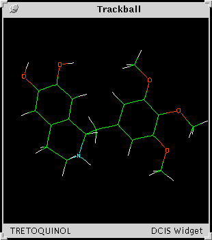
To rotate the "trackball" from left to right, place the cursor on the left and hold down the Select mouse button
When the button is pressed, the trackball outline will appear. Drag the cursor from left to the right to rotate the front of the structure in that direction.
By keeping the cursor outside the sphere, the structure can be rotated about the "z-axis" normal to the screen.
By selecting from the popup menus, the user can customize the Trackball display in several ways. Bring up the "3-D props" popup menu by locating the cursor anywhere on the display area and pressing the Menu mouse button.
Changing the Depth cue setting can improve the 3D effect, depending on the monitor type and the personal preferences of the viewer. Experiment to find the best mode of operation.
Rotate allows the structure to be rotated 90 degrees up, down, left or right. Resolution affects how often the structure is redrawn, and is adjustable to provide a suitable compromise between appearance and performance.
The structure can be set in constant motion in several modes. The default is to rotate steadily, or the structure can be rocked back and forth.
The 'Random' mode changes the axis of rotation after a specified interval.
8. The Status Widget

The status widget is used to inform the user about the status of an
ongoing program or process within a program. Status widgets are
typically used when a program is going to take a significant amount of
time to do something without producing visible output, e.g. proceesing
a large file or loading a database.
Three related functions are provided by this widget: showing the user what process is active, indicating the rate of progress, and allowing the user to abort the process via a time-out mechanism.
Normally, a status widget pops up when a lengthy process starts, displays progress while the process is running, and disappears when the process finishes.
A status widget typically shows the name of the active process, an indication of progress updates, and how long it has been running since it was invoked. If the program knows the extent of the problem (e.g. processing a list of known length), the widget may be able to provide other information such as percentage complete and estimated time of completion.
A program may optionally specify a timeout interval (might be the normal time for completion, an estimate of the user's patience, or a user-specified value). If specified, the widget will "time out" when more than the specified amount of time has passed since invocation. The widget allows the user various options at that point, e.g. to abort, to continue for another timed interval, or to continue to completion without further interuption.
The XView status widget creates a small frame with a title and four text fields labelled "Progress:", "Spent:", "Timeout:", and "To go:". The title indicates the process for which status is indicated. The widget is updated at a rate determined by the calling program, but not more frequently than once per second.
The "Progress:" fields indicate the rate of progress. If the process limit is known, 100% represents the total process and percentage done will be provided.
The "Spent:" field indicates the amount of clock time spent on the indicated process since the widget was invoked. If a timeout interval was specified, the "Timeout:" field indicates the time until the next time out. If a process limit is known, the "To go:" field indicates estimated time until completion. This estimate is based on the process limit and rate progress so far; various circumstances can make this wildly inaccurate, e.g. an unrealistic limit was specified or later parts of the process take longer than earlier parts.
If the timeout interval has expired when the widget is updated, the user will be presented with a blocking notice which indicates the process that timed out, an estimate of time-to-complete (if possible), and three choices: "Abort", "Continue for X seconds" (where X is the current timeout interval), and "Continue until done".
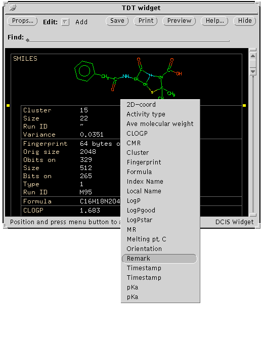
9. The TDT (THOR Datatree) Widget
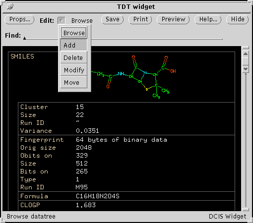
The Datatree Widget provides display and editing functions for Thor datatrees. A `Thor datatree' is the representation of information used by the Thor chemical information system: the root represents a generic chemical structure (typically SMILES), branches represent identifiers of specific structures (e.g. CAS Number), leaves represent data (e.g. melting point).
The Datatree widget displays the tree hierarchy by drawing text within indented boxes. For more information about Thor datatrees, see the Thor User Guide.
Controls on the main Datatree Widget panel
The Datatree Widget appears as a resizable frame containing the datatree display in a scrolling area and several controls on top. Control functions available on the main display panel are:
- Scrollbar
- scroll datatree display vertically
- Props button
- pop-up panel controlling display properties
- Edit mode choice
- select edit mode (Browse, Add, Delete, Modify, Move)
- Save button
- save a modified datatree in its database
- Help button
- show textual help
- print TDT (hard copy)
- Preview
- preview PostScript of would-be hard copy
- Find
- display line containing desired string
- Resize corners
- change the visible height/width of the display
Controlling display properties - the "Props" window
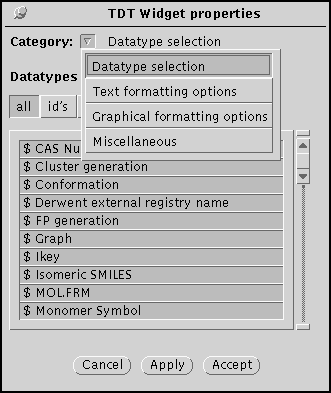
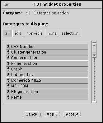
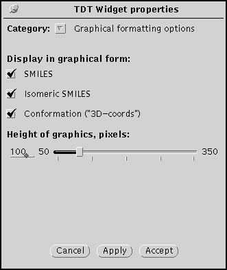
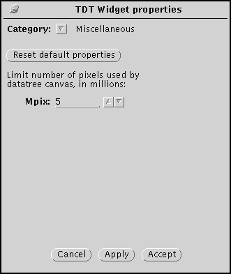
The TDT widget may be modified in several ways by the properties window, which can appear in one of four modes: Datatype selection, Text formatting, Graphical formatting, and Miscellaneous.
The datatype selection panel specified which datatypes are displayed by the TDT Widget. Identifiers are indicated by a dollar sign ($) in the scrolling region.
Note that the 'Apply' button implements the specified choices; 'Accept' also dispatches the window.
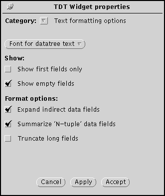
The text formatting panel specifies the appearance of dataitems and their fields in the TDT Widget.
The Graphical formatting panel specifies which data are to be displayed graphically. The slider specifies the size of the depiction.
The Miscellaneous panel specifies the maximum size of the TDT Widget
canvas. If a TDT does not fit in the allocated canvas, lines are drawn
to show the location of missing data.
Editing datatrees
If the database has been opened with write permission, datatree editing is allowed, and the "Edit:" and "Save" items will be active. The initial "Edit:" mode will be "Browse" which is identical to the non-editing display mode with "Show empty fields" checked. Selecting another mode with the "Edit:" choice allows the datatree to be modified in various ways; changes will appear in the display but will *not* be saved to the database until the "Save" button is selected. If you quit the program (or read in another datatree) without saving changes made while in the edit modes, you will automatically be given the opprotunity to save your changes via a pop-up notice.
"Add" mode
Selecting the "Edit: Add" mode allows new dataitems to be inserted into a Thor datatree. When over the datatree display, cursor will change to a "+" and little marks will appear on the margins indicating where an insertion could be made. Pressing the MENU (right) mouse button allows you to choose datatype to be inserted; releasing it with a datatype selected inserts an empty dataitem of that type at the position indicated by the insertion marks.
The "Add" mode only allows you to insert valid datatypes in vaild positions. It is not possible to insert a new dataitem before the root dataitem or between fields of an existing dataitem. If the insertion point is between non-identifier dataitems, the pop-up menu will contain only non-identifier datatypes (identifiers may be added only at the end of a tree or subtree).
"Delete" mode
Selecting the "Edit: Delete" mode allows dataitems to be deleted from a Thor datatree. When over the datatree display, cursor will change to an "X" and sidebars will appear in the margins indicating which items can be deleted. Clicking the SELECT (left) mouse button deletes the indicated item.
In the Delete mode, the sidebars always indicate exactly what will be deleted. Deleting an identifier dataitem deletes it and all attached data. It is not possible to delete the root identifier. Individual datafields cannot be deleted, only dataitems (use the Modify mode to erase the contents of a field).
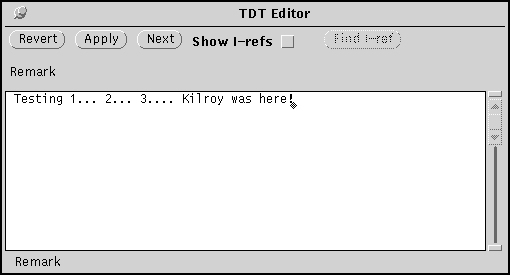
"Modify" mode
Selecting the "Edit: Modify" mode allows the content of datafields to be edited. When over the datatree display, cursor will change to a solid arrow sidebars will appear in the margins indicating which fields can be edited. Clicking the SELECT (left) mouse button invokes the datafield editor with the indicated datafield.
The datafield editor is a separate pop-up window where the main area is a standard XView text editor. All editor features are available; you can type delete, copy, cut paste, find, read and write files, etc. When this text subwindow contains the desired content, click the "Apply" button to apply the changes to the datatree (it won't be saved to the database until the "Save" button is selected). The "Revert" button resets the text subwindow contents to what is currently in the datatree. The "Next" button does an "Apply" on the current field and selects the next for editing. To cancel editing, pull the "pushpin" out.
When editing indirect datafields, you must enter an appropriate indirect key. To make this task easier, checking the "Show I-refs" checkbox splits the window in two: the left window is the one you edit, the right window contains a file of indirect references. When indirect data choices are shown, the "Find I-ref" button is activated - clicking it locates the indirect reference in the file displayed on the right. Both windows are XView text editors, so you can search for desired data in the window to the right, copy from it, and paste into the one on the left. The file displayed in the right window is specified by the option DATATREE_IREFS_EDITFILE.
"Move" mode
Selecting the "Edit: Move" mode allows dataitems to be reordered within a Thor datatree. When over the datatree display, the cursor will change to a two-headed, up-and-down arrow and sidebars will appear in the margins indicating which items can be moved. Clicking the SELECT (left) mouse button marks the item to be moved with a bar to its left, and changes the sidebars to insertion point markers. Clicking again will move the dataitem to the position indicated by the insertion point. The insertion point markers disappear when pointing to an invalid destination for insertion (i.e. not over an item or over the original item to be moved); clicking while pointing to an invalid position cancels the current move.
Any dataitem except the root may be moved. Moving an identifier moves all its attached dataitems with it. Note that moving a non-identifier dataitem from one subtree to another changes the meaning of the datatree (data are associated with the identifier to which they are attached).